The Lt. Columbo Forum
An area where fans from all over can ask each other questions and voice their own ideas and opinions on anything Columbo.This Forum is fondly dedicated in memory of "cassavetes45" (Carleen Zink),
Columbo's greatest fan and a great friend to us all.

Thanks very much cassavetes, yes that's the one. I'll try contacting Steve.
All the best,
Dene.
you're quite welcome. 
Sorry but I guess missed the answer. I too would like to get the Columbo font. Can anyone direct me?
Thanks!
adam, you may be on the threaded style. if you switch to the board style you'll see a thread entitled 'columbo font update' a few threads down.
The original run of the series in the '70s used Helvetica, or something very close to it. Standard Helvetica Bold, with a 2 point stroke and stretched horizontally, is a very close match; but there are dozens of variations of Helvetica (along with a lot of ripoffs), so it may be an exact match to one of them. The second run of the series in the '80s, '90s, and '00s definitely used Clarendon.
Helvetica and Clarendon are both extremely common/popular fonts, and have been so for ages (though they are nothing like each other, given that one is a sans serif and the other is a slab serif). For example, you'll find Helvetica on American stop signs, among countless other places. Clarendon was the first registered typeface in history, and was commonly used on "wanted posters" in the American West; was used on U.S. National Park Service signs for ages, and in countless other places.
The only exception I know of was the most recent episode of Columbo in 2003, which if I remember right, used some random, probably internet-age, font. Whatever it was, it certainly wasn't Helvetica or Clarendon.
most recent columbo of 2003? are you referring to Columbo Likes the nightlife? just curious.
Yes. That one used a completely different font than any of the previous episodes. Also, I think it was in white rather than yellow, but I'm not positive about that.
nothing more bothers me then when most tv shows feel the need to change something, usually for the worse, near the end the show's life.
Helvetica and Clarendon are both extremely common/popular fonts, and have been so for ages (though they are nothing like each other, given that one is a sans serif and the other is a slab serif). For example, you'll find Helvetica on American stop signs, among countless other places. Clarendon was the first registered typeface in history, and was commonly used on "wanted posters" in the American West; was used on U.S. National Park Service signs for ages, and in countless other places.
The only exception I know of was the most recent episode of Columbo in 2003, which if I remember right, used some random, probably internet-age, font. Whatever it was, it certainly wasn't Helvetica or Clarendon.
Max', thanks for your insights. And while it may be true that the original "Columbo" font bore resemblances to other, somewhat standard fonts, the thread that the OP references was from a fan who devoted considerable effort to recreating the exact, and somewhat unique font that was in fact used. And he generously posted a link for fans to download it.
As to CLTNL (which I happened to watch again just last week-end), it is true that this one uses a completely different font. This was in line with the episode's whole style of putting Columbo into a completely new and different environment. Frankly, I think that the episode is much under-appreciated, and was a highly respectable sign-off for our old friend, dragged-into a new age yet still victorious using his trademark horse-sense.
Max', thanks for your insights. And while it may be true that the original "Columbo" font bore resemblances to other, somewhat standard fonts, the thread that the OP references was from a fan who devoted considerable effort to recreating the exact, and somewhat unique font that was in fact used. And he generously posted a link for fans to download it.
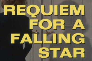
The 1970s Columbo font is actually Folio, which along with Univers, was released at the same time as Helvetica. All three fonts are very similar to each other, and are all based on the much older Akzidenz-Grotesk font. I was thinking the Columbo font was a modified version of, or variant of, Helvetica, until I saw the uppercase "Q" in the title of "Requiem For A Falling Star", which is distinctively Folio:


Well done, Maxim! Thanks for clarifying this.

No problem.
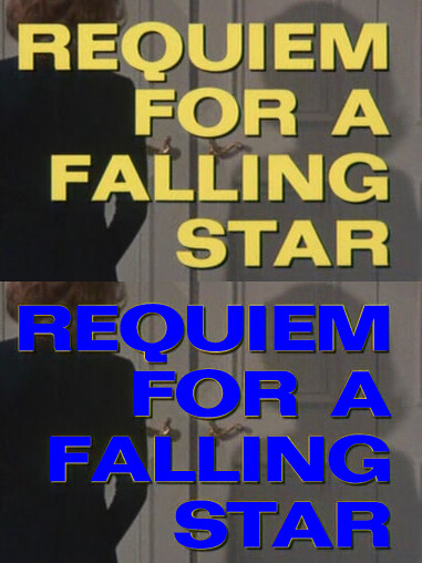
Specifically it is called "Folio Bold Extended", and it can be downloaded free here.
Here is what it looks like typed on top of the actual onscreen font:

That is with no modifications to the letters at all, not even stretching (just used regular 57 pt). Only slight changes in the spacing between the letters (kerning) were needed to make the letters all line up.

